Dashboard
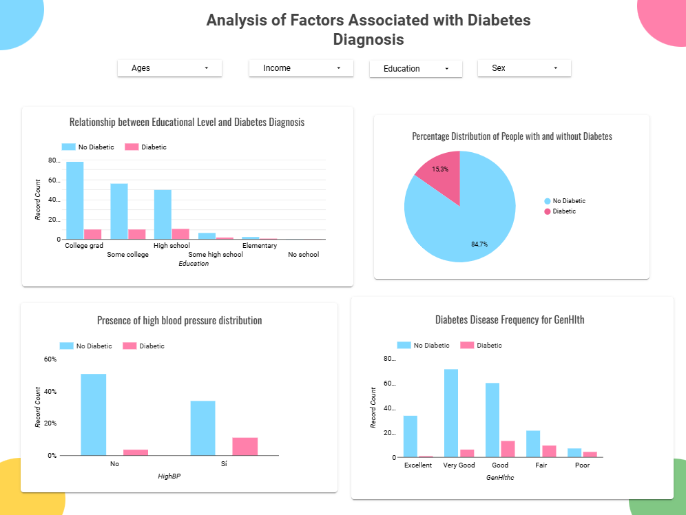
The dashboard is a visual representation of the exploratory data analysis (EDA) results. It provides an interactive interface to explore the key patterns and insights derived from the dataset. The dashboard includes various visualizations, such as bar charts, line plots, and heatmaps, to illustrate the relationships between different features and the overall data distribution.
Designed to be user-friendly and intuitive, the dashboard allows users to dynamically interact with the data. It enables filtering and sorting based on specific criteria, comparing features, and visualizing patterns uncovered during the EDA process. The focus is on supporting data exploration and understanding rather than showcasing model performance, making it a comprehensive summary of the dataset's characteristics and trends in a visually appealing format.
To access the dashboard, click on the link below:
Visualizations